In Part 1 of this three-part typography series, we learned the basics about typefaces and fonts. In Part 2, we then addressed some of the basic how-to’s of choosing the right typeface for your next website project.
In this third and final installment of our series on typography, we go a step further and outline what it really means and how to think conceptually about typefaces and your overall website design choices. So be prepared to put on your creative hats and enlist what you’ve learned in this series—it’s time to tie everything together and think more deeply about the fonts and typefaces you choose to represent your digital landscape presence.
To help you best value, be most prepared for, and begin responding to your type choices, this article is broken into three parts:
1. Why Type Choices Matter So Much
At this point in the series, it should be clear: Type choices will affect your website design and your target audiences’ experience, especially their first impressions of who you are and what you do. Type, just like imagery, evokes emotion and feeling. But sometimes we don’t value this. Instead, many businesses invest the bulk of their energy choosing from generic stock photos to represent “who they are,” and typefaces unfortunately takes a back seat in the process.
However, taking some extra time to think about your typography choices and the feelings they convey can really set you apart.
For instance, have you ever visited a website that for some reason immediately evoked feelings of anxiety or other equally negative reactions, while other sites you’ve been to have had a calming effect? You aren’t alone. Often, your emotions are directly related to a site’s use of typography. Take a look at the comparison of these two blog pages:
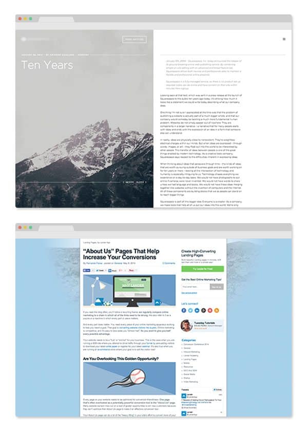
The first is without a doubt visually cleaner and very nice to read. While the lower page has copious links, colors, pictures and images—all relentlessly demanding your attention. Yes, your eyes are more active on the latter page, but this isn’t necessarily positive. Neither is it an ideal experience if you want someone to focus on your content—and not all the noise around it.
Mini Case Study
Still not convinced? Here’s a real-life case study that highlights how heavily your font choices can affect your audience and your website’s overall credibility.
In July 2012, Errol Morris conducted a very interesting experiment. He had a passage from The Beginning of Infinity by David Deutsch published in The New York Times. Morris then asked two YES or NO questions at the end of the passage to find out if the readers agreed or disagreed with the passage. But in reality, Morris wasn’t interested if they agreed or not.
Published in six different typefaces (Baskerville, Helvetica, Comic Sans, Computer Modern, Georgia, and Trebuchet), the goal of Morris’ questions was to see if a typeface could persuade a reader to answer one way or the other. And what he uncovered was a resounding yes; typefaces can drastically compel a reader to believe one thing over another, and vice versa. Based on responses, Comic Sans attained the most disagreement, while Baskerville produced the most agreement with the statement.
In Morris’ article, he then outlined countless more examples that proved this typeface fact. His examples included everything from how typeface choices can affect college essay grades and commercial website design impressions; to how the advent of the typewriter gave people and businesses a tool to control how readers perceived them (as opposed to handwriting’s very personal insights); and so on and so on.
Through it all, Morris’ point endured: Typefaces matter! So, think twice about which one you choose to represent your website.
Font Tip: Its not enough to choose a font just because it “looks cool.” You have to think about how it resonates with you and what kind of characteristics it conveys.
2. Typefaces Don’t Always Stand Alone: Pairing Your Typefaces
Think you’ve got your typeface nailed down? It’s the one for you? Before you decide indefinitely, remember that your choice may not always stand-alone—you’ve got to be prepared (or at least have a plan) for partnering it with another typeface in the future. But what does this really mean?
When we talk about using more than one typeface, the concern is that things can get sloppy fast. However, if used thoughtfully and with purpose, two or even three typefaces can create a very seamless (or purposefully chaotic) website design. And while finding a good pairing could seem like an impossible task at the get-go, there are many great typographic inspiration sites out there to help you along.
Here are a few that I like:
- Fonts In Use
- Good Typography
- Typophile
- Letter Cult
- Friends of Type
- Typographica
- Serifs & Sans
- From Up North
- Type Novel
One thing that is very helpful when pairing typefaces, is consciously thinking about the structure of the typography in front of you. I recently learned this from Jessica Hische in one of her recent blog posts. Hische instructs us to think of a font in three parts: The skeleton, the meat, and the clothes. Look at the illustration below:
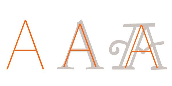
The skeleton establishes all the basic proportions and components of the letter. The meat of the typeface can drastically change, but it still resembles core characteristics. And the clothes are the serifs, lines, and decorations that make the typeface unique. Using a typeface that has a similar structure to your flagship typeface will drastically help you decide on a perfect pairing. If two typefaces share a similar structure, the visual unity will be much better and integrate more seamlessly into your website design.
Font Tip: You can always get a designers suggestion on what would look well paired with your flagship typographic choice. Don’t be afraid to ask. Designers love talking about typography!
3. Get Moving in the Right Conceptual Direction: Mind Mapping
Now that you really see the impact typography has on people, it’s a good idea to explore what really defines your digital marketing campaign and how you’re going to find the typeface to complement it.
A good place to start is with an exercise known as “Mind Mapping.” Developing a mind map will help you begin to explore what you need in a typeface. To begin, just start writing down characteristics, emotions, buzzwords, and whatever you can think of that would help define what you’re trying to create or communicate on your website. Once you feel you have exhausted every possible idea, circle a few of the best ones. This can help you discover what is important about your digital landscape. It can also help you figure out qualities that need to show through to your audience and may reveal traits that are really important for your audience to retain. In the end, once you have your list of characteristics and qualities, you can choose a typeface that supports those qualities you just discovered.
Font Tip: Don’t be afraid to write down some of the most insane thoughts. This can often lead to the BIGGEST and BEST IDEAS.
So many people underestimate the power of typography. Choosing a typeface is often hard for people to do. I’ve experienced so many projects where people overlook their typographic choices and settle with convenience. It doesn’t have to be this way. Thinking about how your message is going to be communicated and received is a step that should not be overlooked.
Typography is a beautiful tool that can truly help improve your website design and presence in the digital landscape. If you take the extra time to really think about your typographic choices, you will be rewarded. You don’t have to be a typographic genius to find something that really works for you. And doing so doesn’t have to be overwhelming. Using the tips, tricks, and resources in this typography series will surely help you in your typographic future.
If this typographic series was helpful, or if you have any questions, let us know in the comments section below—or even contact us directly! And as always, feel free to find me on Twitter, Dribbble, Instagram, and Designspiration. I love to talk typography and all things graphic and website design.